A11y Helper

A11y Helper

The primary goal of A11y Helper is to integrate accessibility checks directly into the design workflow, making it easier for designers to create inclusive experiences. This project aims to raise awareness around accessibility issues and promote best practices within the design community.

The obssession begins 👀

The obssession begins 👀

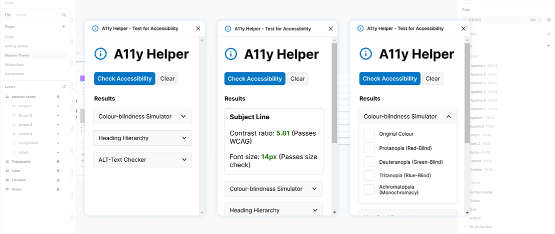
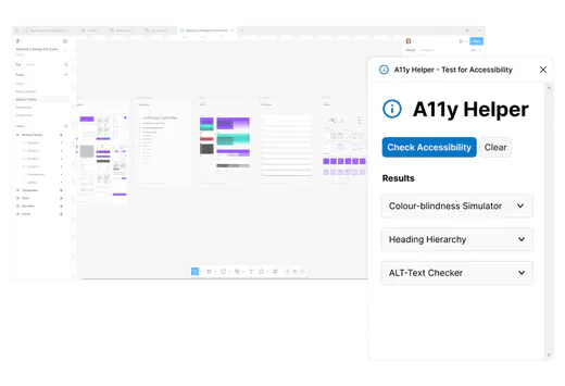
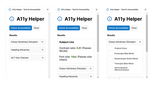
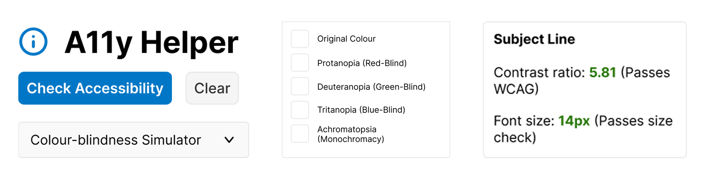
What made me start this project was the difficulty I had when it came to human-first design, in particular I found that creating a design, only to spend the same amount of time redoing it because of contrast, spacing or sizing problems frustrating and very manual. Most recently, I audited the initial concepts for the Begin Bright website, and identified many easily avoidable readability issues.

At the time, there was little WCAG support in the Figma interface (they have since introduced new features, e.g., contrast colour picker) and - at the end of my tether - I decided to take matters into my own hands.

Problem + Solution

Many designers overlook accessibility until the end of the design process. This practice is up to 100x more expensive* than incorporating accessible design from the get-go. The A11y Helper plugin integrates accessibility checks into the design workflow, enabling proactive adjustments.

The most practical solution that I felt like I could do with my kind of limited coding experience was to create a simple plugin to keep track of errors directly in the Figma app, covering the most common accessibility problems that are often overlooked.

Features

WCAG contrast checker: Checks if text has appropriate contrast (7:1 for normal text & 4.5:1 for large); Font size: Ensures text size is at least 12pts or has the appropriate font weight; Line height: Flags text blocks that have smaller than recommended line height (font size*1.5); Text alignment: Reminds the designer that left-aligned text is more readable than others; Colour-blindness simulation: Displays the different visual appearance of colours from types of colour-blindness; Headings hierarchy: A rudimentary analysis of headings based on text-size, weight & position
K.I.S.S UI

K.I.S.S UI

The UI design of A11y Helper focuses on simplicity and clarity, allowing users to easily access the functionality they need. I crafted a user-friendly interface that integrates seamlessly within Figma, ensuring that accessibility checks can be performed without disrupting the design flow. The plugin visually distinguishes the various checks, making it easy for users to navigate and utilise the available features.


Simple UI Kit

Buttons, dropdowns and text areas used in the UI
What I learned

What I learned

  • Understanding the importance of continuous user feedback in plugin development
  • Enhancing knowledge of WCAG guidelines and their practical applications
  • Realising the impact of design on user inclusivity and accessibility

Up next: What I’m doing now

While the features of A11y Helper positively help the design community with creating thoughtful accessible experiences (or at least the 31 people who got the plugin so far), I couldn’t help but feel that something was off - like it was unfinished. I found myself feeling unsatisfied, and enlisted the help of one of my UXer friends to help out. We started asking questions like; do people see accessibility guidelines as a checklist? Do they know why its important, and what types of people benefit from accessibility considerations? Is neurodiversity being recognised here? Our little team of two are now working on a way to address this, especially as we are both neurodivergent women, who both design products for people, and consume products from a different perspective. Big things coming soon - watch this space!