A typical morning for me goes like this:
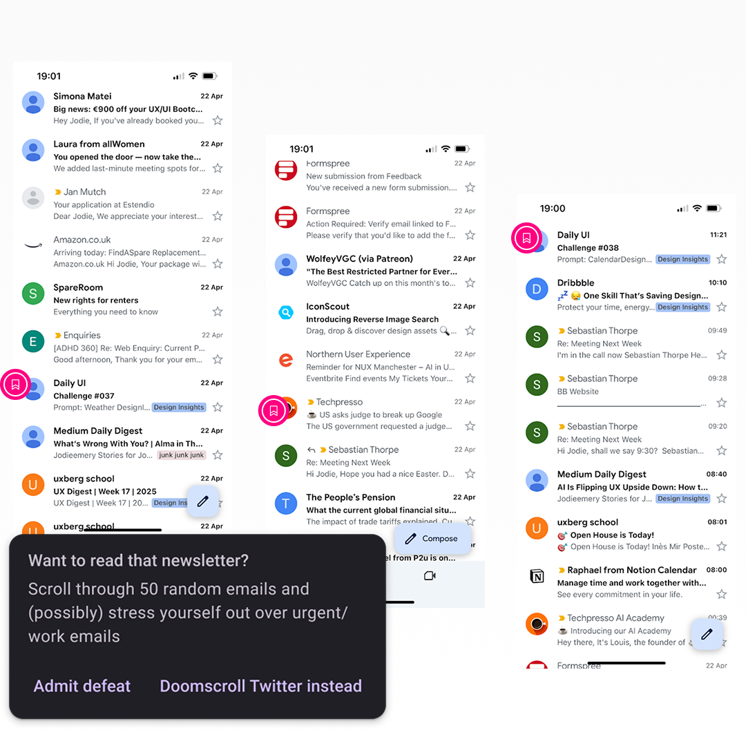
Wake up, shower and get ready for the day, leaving myself 20 minutes of time to have breakfast and catch up on industry news and trends. So I pour my coffee, and open up Gmail on my phone, hoping to find new issues of my favourite newsletters. Fast-forward to 20 minutes later, I’m late for work and I only got to read ONE short newsletter!
How you may ask? Simply put: my inbox is EXCEPTIONALLY busy.
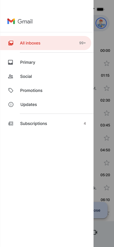
Between all the spam, work emails, emails from people I know outside of work, promotions & sales pitches, are little nuggets of valuable information. This is content that I signed up for and actively want to read regularly, so why should getting there be so inefficient, distracting and stressful?
Research and discovery
I tested Gmail myself, tracking my journey from inbox to newsletter completion. It took 20+ minutes because I had to wade through nearly 50 emails just to read 5 newsletters! My morning ritual shouldn’t involve this much digital clutter!
I browsed forums and polls to understand others’ experiences (love this relaxed research approach—it lets me follow the story naturally). Looking into existing solutions people mentioned online revealed two major unaddressed problems:
Solutions either didn’t really save time or introduced new headaches (Gmail’s unintuitive filters aren’t beginner-friendly)
Many were just expensive add-ons exploiting Gmail’s feature gaps
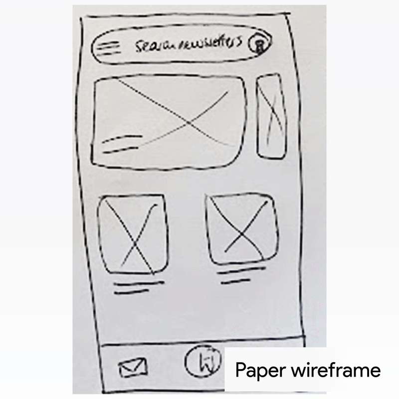
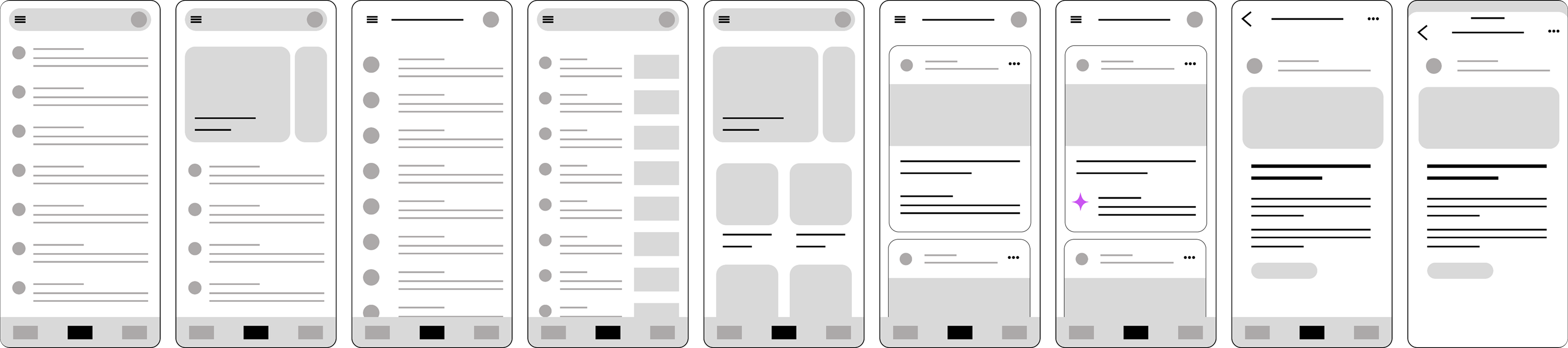
Working with wireframes
With a clear goal in mind, I got to work sketching wireframes to further understand the user flow, the potential for new and interesting features, and exploring what an expansion of Gmail’s capabilities could look like.
By the third/fourth iteration, I had a clear enough template to increase the fidelity levels in Figma, taking the design from rough sketch, to digital wireframes to high-fidelity mockups.
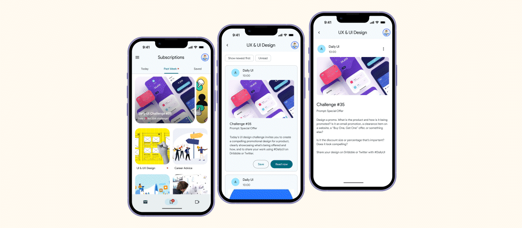
User interface: Exploring Google M3
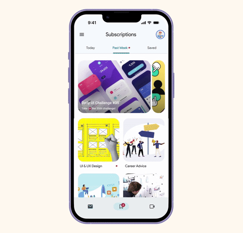
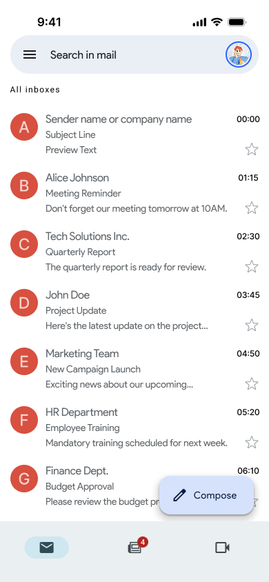
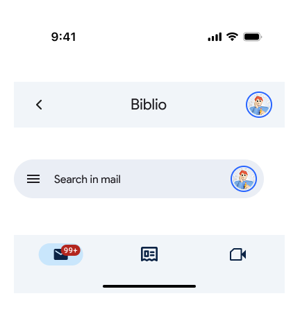
To seamlessly blend the user experience, I utilised a slightly modified* Material Design (3) system to guide the user through the flow, giving them a safe, familiar and delightful way to get reading right in the Gmail app!
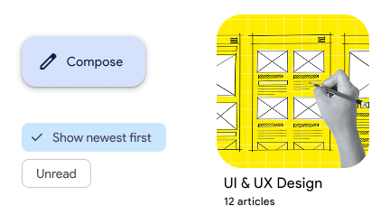
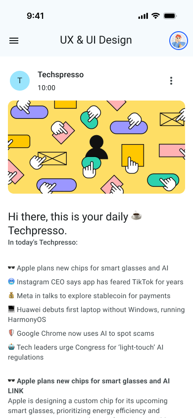
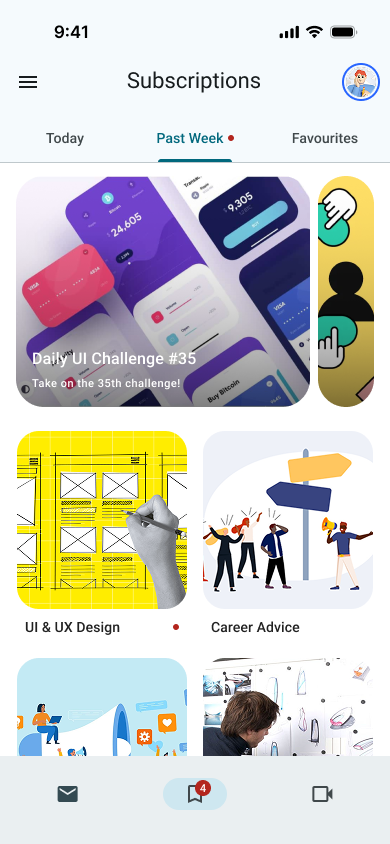
My personal favourite new addition to the Google interface is the fresh new carousel (right), which has a few different variants available. I opted for the ‘hero’ version as it felt more appropriate to have one or two featured/highlighted items over a whole host of them.
*As the iOS version of M3 is not available, I’ve taken some creative liberties to adapt some components for iPhone.
Usability testing
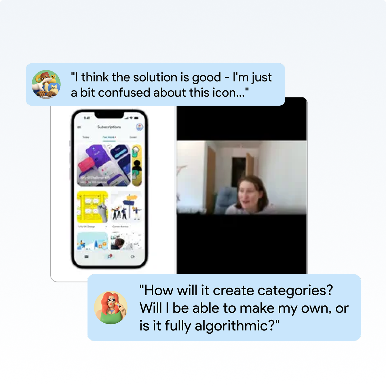
During the tests, I learned that participants spoke highly of Gmail, specifically mentioning how “user-friendly” the interface is. However, a shared sentiment was that the newsletter-locating experience could be improved. In the task portion of the tests, participants had both positive and negative interactions with the solution. Some key roadblocks were:
Iconography
Indicators
Navigation
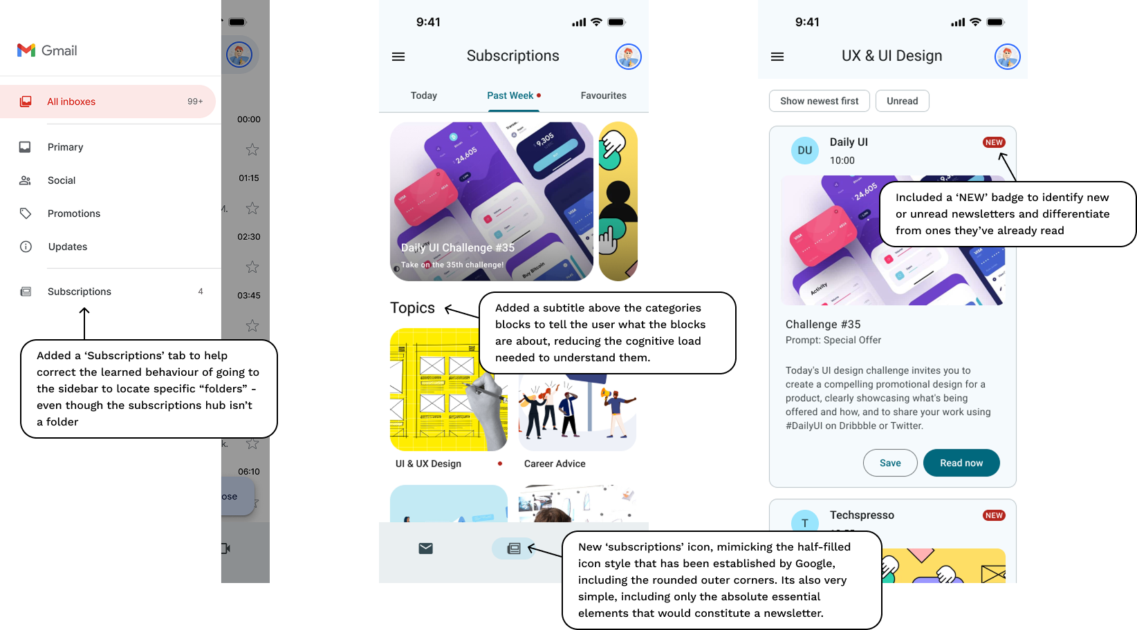
Auto categories
Saved items
Areas for improvement
Iconography
Some icons were confusing or ambiguous. Participants suggested clearer icons & labels, with text descriptions for accessibility and cross-cultural understanding.
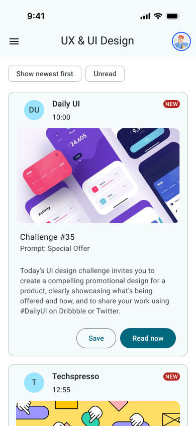
Unread indicators
Users wanted clearer markers to identify unread newsletters inside nested lists/cards. The current red dot or badge was not always clear enough.
Sorting
Concerns that automatic generation of newsletter categories based on email content could misclassify emails, splitting related newsletters.
Saved items
Saved newsletters could become a “graveyard” if not managed; suggestions included push notifications to read or remove saved newsletters.
Post Mortem Discussion
In summary, the exercise revealed that I’m not the only person who still reads newsletters religiously, but more importantly, it revealed that Gmail - while relatively user-friendly - is not perfect. I would argue that it would be wrong to hold any product up as a model of perfection, its more important that we learn from these and ask questions like, ‘why do people do this thing?’, ‘why are people choosing this over another product?’ and ‘what does it mean to be good enough for all?’.
My Gmail solution shows that the new M3 UI is more expressive as promised on its release, and many of the usability test participants remarked that it felt much more lively & visually appealing. In comparison to when using the base Gmail app, a subscription hub seemed to trigger a more exploration-focused navigation style. Rather than attempting to find a way to search immediately, many participants naturally found their way around in a more exploration-driven way. This goes back to the idea that people might engage more with newsletters when in a learning or reading ‘mode’ rather than a ‘work/spam/things-you’re-procrastinating’ mode.