Gmail Subscriptions Hub
A typical morning for me goes like this:
Wake up, shower and get ready for the day, leaving myself 20 minutes of time to have breakfast and catch up on industry news and trends. So I pour my coffee, and open up Gmail on my phone, hoping to find new issues of my favourite newsletters. Fast-forward to 20 minutes later, I’m late for work and I only got to read ONE short newsletter!
How you may ask? Simply put: my inbox is EXCEPTIONALLY busy.
Between all the spam, work emails, emails from people I know outside of work, promotions & sales pitches, are little nuggets of valuable information. This is content that I signed up for and actively want to read regularly, so why should getting there be so inefficient, distracting and stressful?
- Stakeholders
- What's at stake?
Who’s involved?
End-users:
- Email inbox clutter and anxiety
- Difficulty tracking newsletter subscriptions
- Poor organisation of newsletter content
- Risk of missing important newsletter content
Content creators:
- Email is the highest-performing marketing channel with an ROI of $36 for every $1 spent
- Newsletters being filtered into spam or promotions despite being educational/article style content that the user has subscribed to
- Users who aren’t aware that they are subscribed and don’t engage with the content impacts email deliverability for the entire domain, not just newsletters
Gmail/Google
- Making Gmail more pleasant to use
- An addition to the Google suite that makes sense
- Revenue could be gained through the sale of ad space or ‘boosts’ for newsletters
The stakes are high (ish)
As users get bombarded by swathes of emails they don’t care about day in day out, their attention and engagement with email content weakens, leading to content fatigue. With this in mind, consumers are more likely to move away from email, going to competitors in the mass-messaging space. This collapse in usership is characteristic of a platform that is slowly becoming less relevant with each new innovation. My concern is that users will lose out on so much valuable content, as well as the connection that comes with it, and the newsletter eventually becomes extinct.
A memorable account I uncovered during my research was from one Reddit user’s exasperation; I think they sum up why end-users need a solution pretty well:
“I’ve just found out recently that almost any newsletter I sign up for isn’t delivered to my personal Gmail account. I have plenty of storage space and have looked through my filters many times to make sure they aren’t filtering them out. I have then signed up for the same newsletters with my work gmail to make sure they are being sent out, which they are, but they still do not show up in my personal Gmail. They aren’t in Spam, they aren’t in All Mail, they aren’t in Promotions.
This is driving me insane - what else could it be? Any help would be greatly appreciated because this is frustrating having to sign up with my work account each time and it makes me wonder if any OTHER e-mails are somehow also getting filtered too.”

Research and discovery 🧪
I tested Gmail myself, tracking my journey from inbox to newsletter completion. It took 20+ minutes because I had to wade through nearly 50 emails just to read 5 newsletters! My morning ritual shouldn’t involve this much digital clutter!
I browsed forums and polls to understand others’ experiences (love this relaxed research approach—it lets me follow the story naturally). Looking into existing solutions people mentioned online revealed two major unaddressed problems:
1. Solutions either didn’t really save time or introduced new headaches (Gmail’s unintuitive filters aren’t beginner-friendly)
2. Many were just expensive add-ons exploiting Gmail’s feature gaps
Proposed Solution
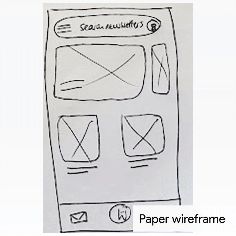
Working with wireframes
With a clear goal in mind, I got to work sketching wireframes to further understand the user flow, the potential for new and interesting features, and exploring what an expansion of Gmail’s capabilities could look like.
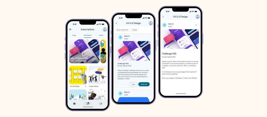
By the third/fourth iteration, I had a clear enough template to increase the fidelity levels in Figma, taking the design from rough sketch, to digital wireframes to high-fidelity mockups.


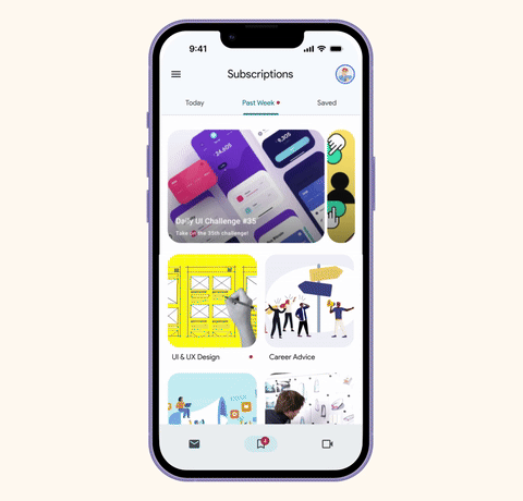
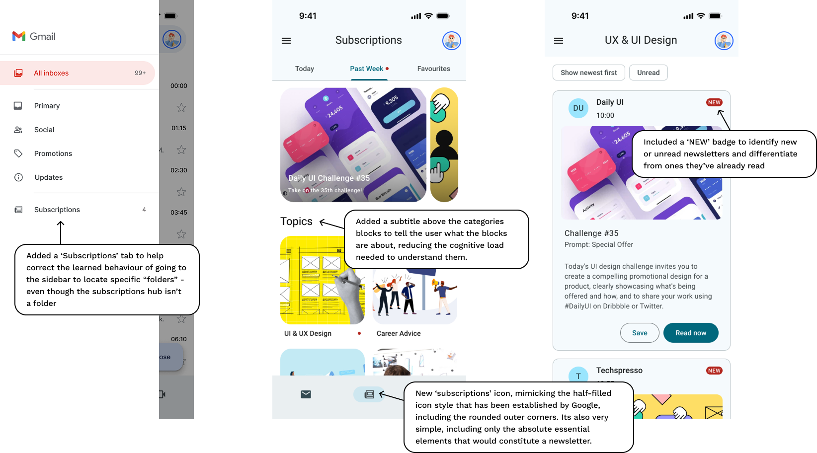
User interface: Exploring Google M3
To seamlessly blend the user experience, I utilised a slightly modified* Material Design (3) system to guide the user through the flow, giving them a safe, familiar and delightful way to get reading right in the Gmail app!
My personal favourite new addition to the Google interface is the fresh new carousel (right), which has a few different variants available. I opted for the ‘hero’ version as it felt more appropriate to have one or two featured/highlighted items over a whole host of them.
*As the iOS version of M3 is not available, I’ve taken some creative liberties to adapt some components for iPhone.


Usability testing
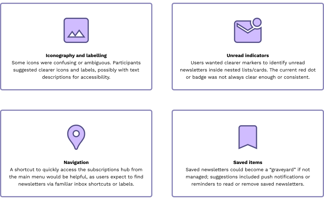
During the tests, I learned that participants spoke highly of Gmail, specifically mentioning how “user-friendly” the interface is. However, a shared sentiment was that the newsletter-locating experience could be improved. In the task portion of the tests, participants had both positive and negative interactions with the solution. Some key roadblocks were:
- Iconography
- Indicators
- Navigation
- Auto categories
- Saved items
Areas for improvement
Revisited UI