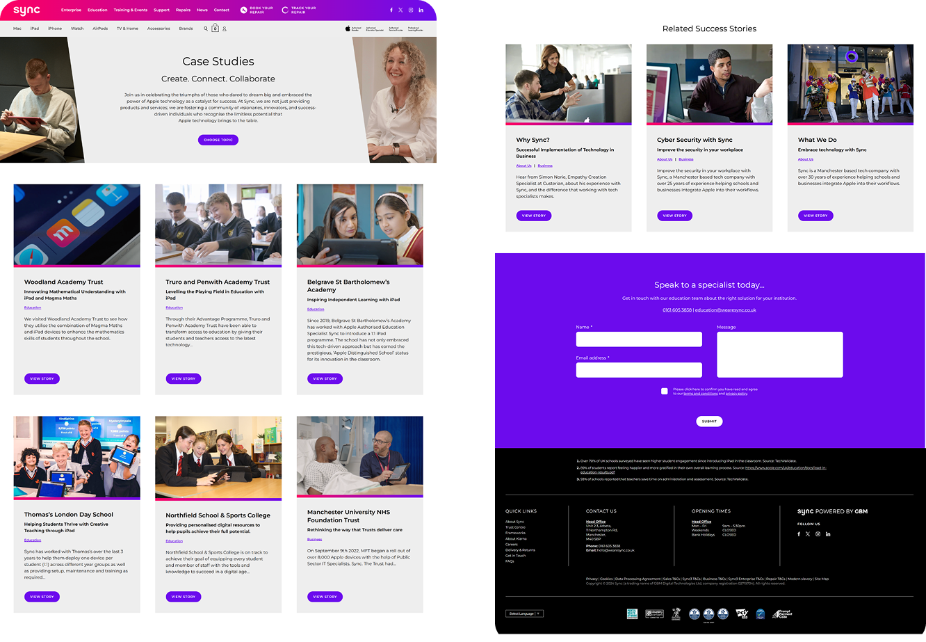
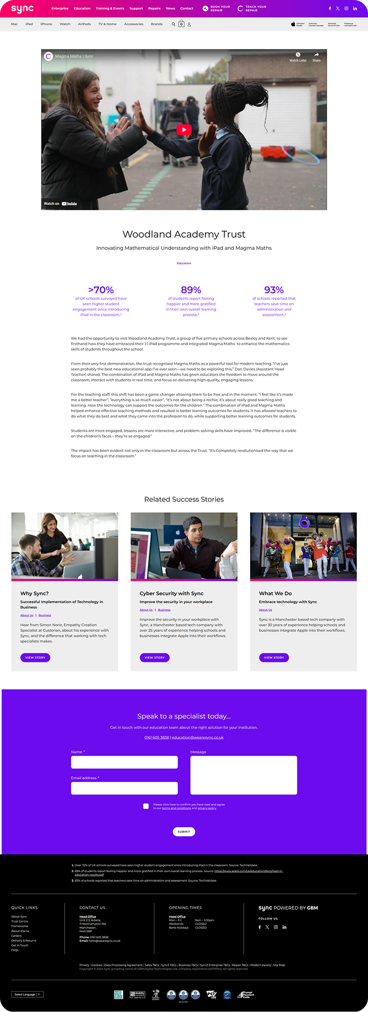
Sync is a growing IT reseller, aiming to deliver value added solutions through a consultative approach. The objective for this project was to redesign the customer testimonial page to make it easier to use, be visually appealing & more organised. The target clients are high-level decision makers with purchase powers who need easy access to case studies and testimonials because they are likely to be in the consideration phase of sourcing a solution for a need they are already aware of.
Starting off with a site page audit, I identified inconsistencies & issues within the pages that had led to;
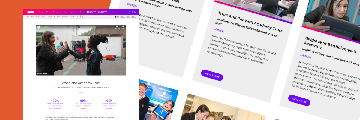
Low visibility could be a result of the page's inconsistent content style and usability issues, such as broken internal linking and low readability.
Rarely updated content can limit the relevance to the intended audience, and can leave gaps where new case studies don't get added.
Low session duration on individual pages suggests that the format and content of pages is disengaging
Find ways to increase usability through the layout of content & organisation. Rethink the templates used to encourage more consistent, structured case studies
After some thought, I felt that the finished design should answer this question:
How can we increase usability through the layout of content & organisation, whilst keeping realistic expectations of developers?
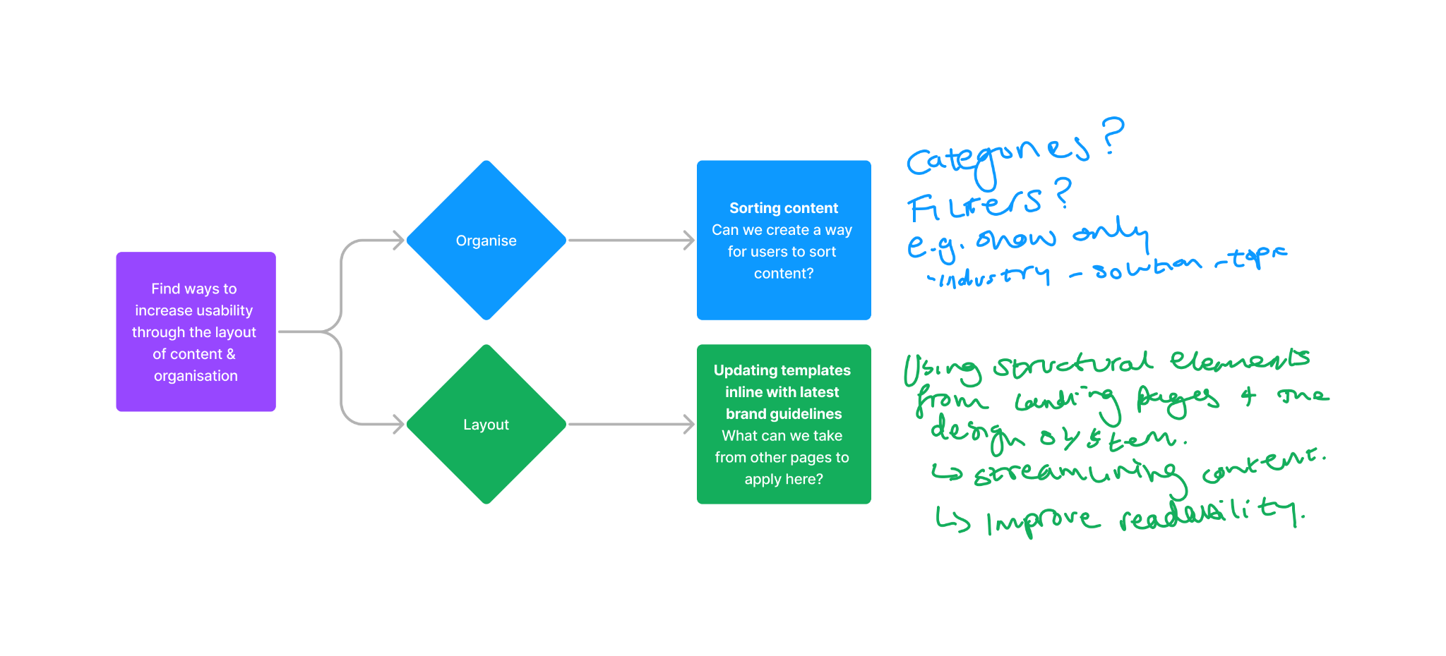
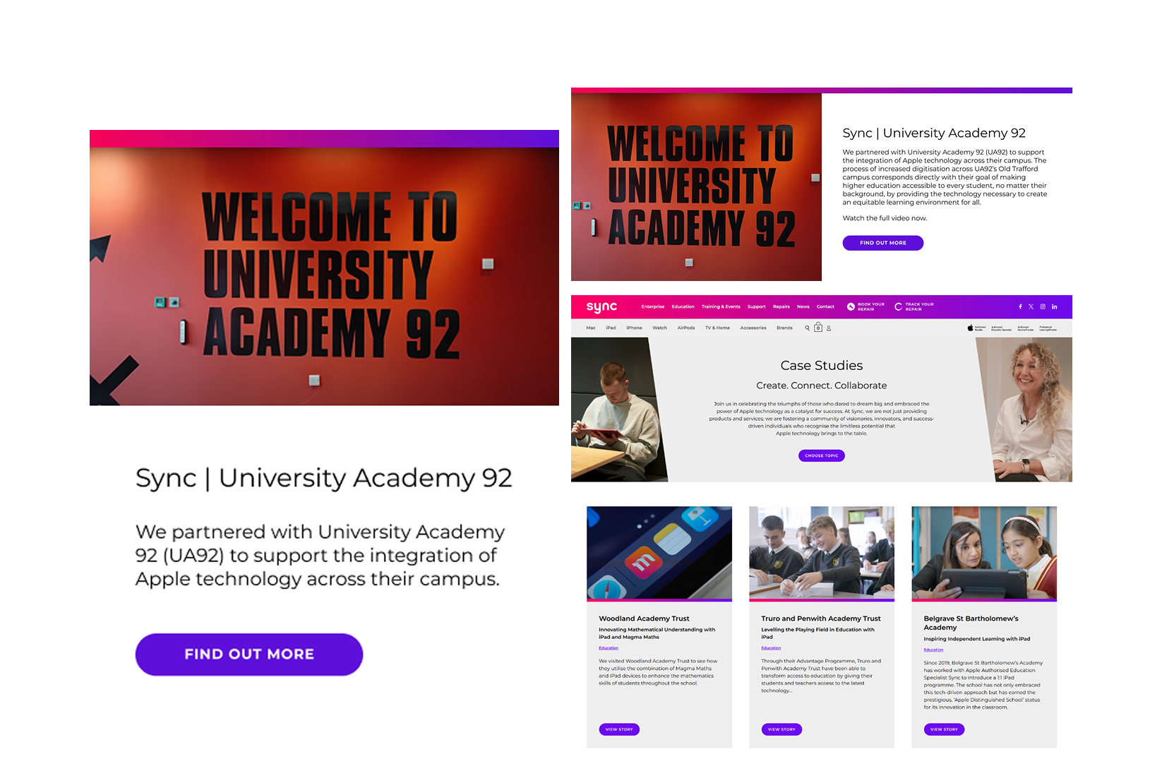
In the first few iterations, I experimented with ways that a user could sort or filter all the case studies. Taking the two strongest concepts, I presented them to management and the wider team to get some feedback and pointers. Following this, I developed a final prototype, taking all the notes and thoughts I'd gathered during the feedback session, ending up with a clean design that ticks all the boxes.
Pitching to developers and higher ups within the company is difficult but definitely do able with the right tools and a well-thought out plan and prototype
The project also showed the importance of collaboration & user feedback in design
Regularly checking content to ensure back-links are current and content hits the freshness factor in Google's rankings. Reviewing the Drop-Off areas and Session Duration to help identify problem areas and provide guidance with improving UX.